

Editor X Responsive Design: Pushing the Boundaries of Modern Layouts
Understanding Editor X Responsive Design vs Classic Wix

When comparing the classic Wix Editor with editor x responsive design, the core difference comes down to fixed vs fluid architecture. The standard Wix Editor was designed for simplicity, allowing users to drop elements freely onto a canvas. However, it relies heavily on absolute pixel positioning and basic mobile view tweaking.
On the other hand, Editor X was engineered ground-up around modern CSS standards. It brings CSS Grid, Flexbox alignment, and proportional scaling into a drag-and-drop ecosystem, giving designers full architectural control over web layouts. To understand how these platforms match up for long-term project planning, review our in-depth breakdown on Editor X vs Wix Guide.
Fixed Gridlines vs Fluid Responsiveness
In the traditional Wix environment, content is pinned within standard gridlines (typically 980 pixels wide). To keep things readable on smaller displays, elements must stay within these safe horizontal boundaries. Adjustments on mobile are handled through a secondary layout layer where elements are stacked vertically or hidden manually.
Conversely, editor x responsive design operates on continuous layout mechanics:
Fluid scaling: Elements resize smoothly using percentages, fractional units (fr), or viewport dimensions (vw, vh) rather than fixed pixel dimensions.
Docking parameters: Elements are pinned to section edges (top, bottom, left, right) with fixed or proportional margins, maintaining their spatial relationship during screen resizing.
Grid containers: Page sections use multi-row and multi-column CSS grids that dynamically scale or reorganize across screen width shifts.
The Evolution to Wix Studio
While Editor X brought advanced CSS control to visual builders, Wix introduced Wix Studio to further streamline workflow speed, agency collaboration, and responsive AI generation.
Wix Studio builds upon the foundation of editor x responsive design, refining features like auto-fitting layouts and fluid typography controls. For creators managing existing Editor X projects, understanding this evolution helps future-proof web builds. Explore the technical shift in our analysis on Wix Studio vs Editor X Overview.
Managing Breakpoints and Cascading Rules
Breakpoints represent the specific viewport thresholds where a web layout restructures itself to fit different screen dimensions. Mastering breakpoints is essential to delivering clean responsive layouts.

How Cascading Style Rules Work
Editor X handles style adjustments across devices using standard CSS cascading logic. By default, changes flow downstream from wider viewports to narrower ones:
Desktop Viewport (Default Primary): Global styles, structure, and content are established here.
Tablet Viewport: Style overrides applied here apply to tablet and mobile views, but do not affect desktop dimensions.
Mobile Viewport: Targeted mobile styling overrides apply only to small screen dimensions.
By organizing your layout top-down from desktop viewports, you avoid redundant editing work across smaller viewports. For a detailed video walkthrough of this structure, refer to this community Breakpoints Guide.
Custom Breakpoints for Unique Screens
Standard configurations cover default desktop (1001px+), tablet (751px–1000px), and mobile (320px–750px) dimensions. However, custom hardware formats—such as widescreen displays or small mobile displays—sometimes require custom rules.
In Editor X, you can create custom breakpoints by clicking the breakpoint bar at the top of the canvas and setting specific pixel values. This enables custom layout shifts for multi-monitor desktop setups or targeted tablet orientations.
Key Layout Mechanics: CSS Grid, Flex Layouter, and Fluid Sizing
To eliminate layout breaks, editor x responsive design uses three core structure tools: CSS Grid, Flex Layouter, and proportional sizing settings.
Modern Tools for Editor X Responsive Design
Knowing when to apply CSS Grid versus Flex Layouter saves build time and keeps your page architecture maintainable.
Feature / Tool | CSS Grid | Flex Layouter |
Primary Dimension | Two-Dimensional (Rows & Columns simultaneously) | One-Dimensional (Single Row or Single Column) |
Best Use Case | Overall page sections, complex card grids, portfolio layouts | Header navigation menus, button sets, simple card flows |
Responsiveness Mechanism | Grid track sizing (fr, %, auto, minmax) | Flex wrap, auto-packing, uniform spacing controls |
Content Alignment | Cell-based structural alignment | Directional alignment (space-between, space-around, center) |
For practical step-by-step implementations of these structural tools, check out tutorials on responsive grid mechanics.
Fluid Sizing, Docking, and Text Scaling
Creating adaptable layouts requires moving beyond fixed pixel widths. Editor X provides flexible sizing options for every design element:
Fluid Units (% and vw/vh): Setting container widths to percentages or viewport widths ensures they stretch and shrink in proportion to the browser window.
Docking: Pinning an element to a container edge (for example, top-right docking for a user account icon) keeps it properly anchored across browser resizes.
Text Scaling: Setting min and max font size limits alongside fluid text values prevents headlines from breaking lines awkwardly on tablet screens or shrinking into illegible text on mobile displays.

Practical Workflows for Mobile Optimization and Elements
Converting desktop interfaces into high-converting mobile experiences requires careful optimization of layout elements and interactive navigation components.
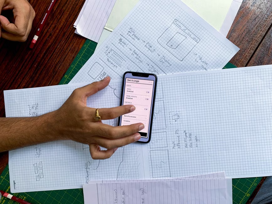
Advanced Workflows in Editor X Responsive Design
A common desktop challenge involves translating wide horizontal sections—such as three-column product features—into tight mobile spaces. Using Flex Layouter, you can switch container direction from horizontal row flow to vertical column layout on smaller breakpoints.
Additionally, secondary visual assets can be hidden on mobile viewports to streamline loading speed and page scroll depth. For technical design execution tips, review this Figma to Editor X Responsive Tutorial as well as our guide on Web Design Best Practices.
Testing and Previewing Across Viewports
Relying exclusively on editor preview modes can occasionally mask hardware-specific rendering quirks. Follow this verification sequence before launching new layouts:
Canvas Drag Preview: Use the interactive viewport slider on the editor canvas to check for layout overlaps across custom widths.
Browser Inspection: Test published staging URLs using browser developer tools to inspect CSS grid lines under emulated hardware settings.
Physical Device Validation: Test the site on actual iOS and Android devices to verify tactile touch responsiveness, header scrolling behavior, and mobile browser address bar padding.
If you encounter unexpected rendering discrepancies between canvas previews and live mobile devices, refer to community solutions in this Editor X Troubleshooting Discussion.
Migrating Legacy Sites and Master Class Resources
Upgrading an older website structure to an adaptable CSS architecture requires structured planning, layout mapping, and design system updates.
Transitioning Classic Wix to Responsive Frameworks
Because classic Wix sites and Editor X operate on fundamentally different layout engines, automated one-click migrations are not technically possible. Transitioning a classic site to a fully responsive structure involves a manual rebuild:

Audit Existing Site Content: Export original image assets, copy decks, and media files from the existing site.
Define Layout Grids: Map out core section layouts using CSS Grid and Flexbox rules prior to building.
Rebuild Page Structures: Construct base desktop layouts using fluid containers, docking parameters, and scaled typography.
Refine Across Breakpoints: Adjust cascading overrides across tablet and mobile viewports.
To review migration strategies or plan a platform rebuild, explore our complete Website Redesign Guide or review specialized Wix Classic Rebuild Services.
Top Community and Learning Channels
Mastering continuous visual responsiveness requires ongoing practice and feedback. Recommended design resources include:
Academy X: Official learning library containing structured video courses covering CSS Grid, Velo scripting, and flexbox mechanics.
Community Webinars: Hands-on instructional sessions demonstrating advanced site builds, design system setups, and performance optimizations.
Design Challenges: Monthly layout prompts that help designers practice responsive techniques using complex UI patterns.
Frequently Asked Questions About Editor X Responsive Design
How do cascading rules work across breakpoints in Editor X?
Cascading rules apply styles from larger viewports down to smaller viewports. Changes made on the desktop view automatically apply to tablet and mobile views. However, adjustments made on smaller breakpoints—such as altering font sizes on mobile—override inherited desktop styles for that specific viewport and smaller views, without altering the desktop layout.
Can you automatically convert a Classic Wix site to Editor X or Wix Studio?
No, direct automated conversion is not supported due to structural architecture differences between the platforms. Classic Wix uses absolute positioning inside fixed grid boundaries, whereas Editor X and Wix Studio rely on fluid CSS Grid and Flexbox engines. Upgrading requires rebuilding the page structure within the responsive builder environment.
What is the primary difference between CSS Grid and Flex Layouter?
CSS Grid is a two-dimensional layout framework that manages both rows and columns simultaneously, making it ideal for overall section structural design. Flex Layouter is a one-dimensional framework designed to align items in a single direction (as a row or column), making it ideal for dynamic UI components like navigation bars, button strips, and stacked cards.
Conclusion
Mastering editor x responsive design transforms how digital platforms adapt to screen size changes. By leveraging CSS Grid, Flex Layouter, fluid typography, and cascading breakpoints, creators can build fast, visually engaging websites that perform flawlessly across desktop, tablet, and mobile displays.
At S9 Consulting, our team helps businesses architect high-performing web platforms, integrate custom workflows, and transition legacy sites into modern visual frameworks. Whether you need expert structural layout guidance or end-to-end site optimization, explore our tailored Wix Development Services to bring your web experience to life.


